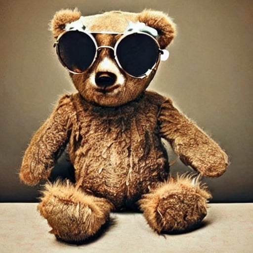

“another fighting game character” YOU DARE DISRESPECT THE THWOMP
I’m pretty adorable, but I’ve seen some shit.


“another fighting game character” YOU DARE DISRESPECT THE THWOMP
Can you fix the grammar too?


I always thought the colors were dumb. Imo this is what the color scheme should be:
A/Circle=Green=Accept=Go
X=Red=Cancel=Stop
B=Blue
Y=Yellow
Put them wherever you want lol and I guess square feels blue and triangle feels yellow (kinda looks like an upside down y and a y has 3 points). It also satisfies the original intent for ps buttons without being confusing since x and circle are represented with the commonly known colors for those things. I personally prefer the asymmetrical Xbox stick/button layout.
And actually now that I’m thinking about it it’d be kinda cool if the triangle was flipped and the square had a horizontal line through it, then circle could be like a lower case a. Then you have both ps AND Nintendo/Xbox labels XD


I did, I forgot about Zoolander. That one’s great too, but not in the same way as the other 2 imo. But yeah there is some talent in there XD


But Hillary’s emails and Obama’s tan suit!


Ben Stiller. I just can’t get into anything he’s in. He’s just reading lines, nepo-baby for sure.
Exceptions: dodgeball, and tropic thunder, holy FUCK is he funny in tropic thunder
Fair, I just found it funny XD